Popzilla — Popcorn Branding & Packaging Design
Big on Flavour. Bold by Design.
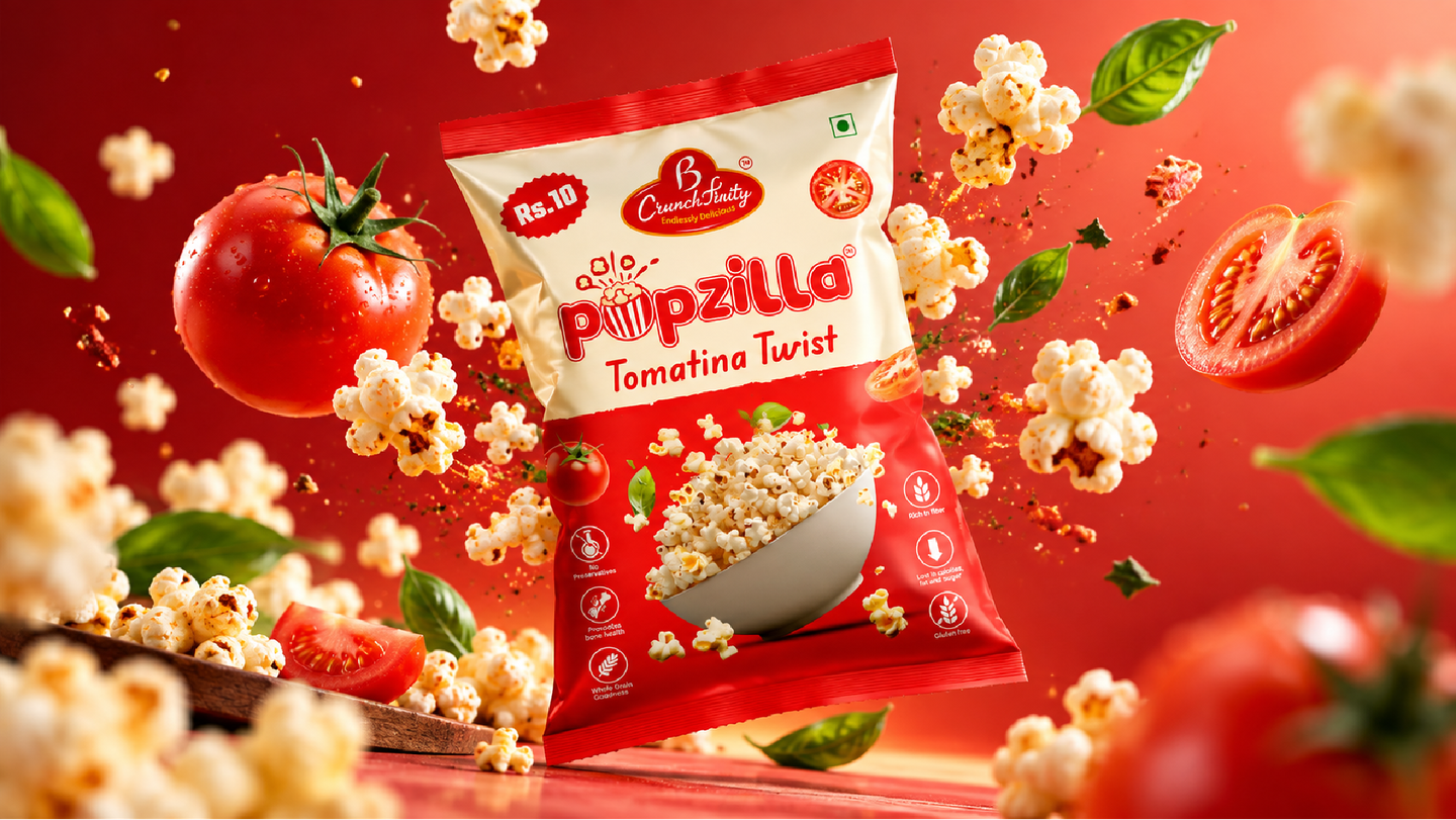
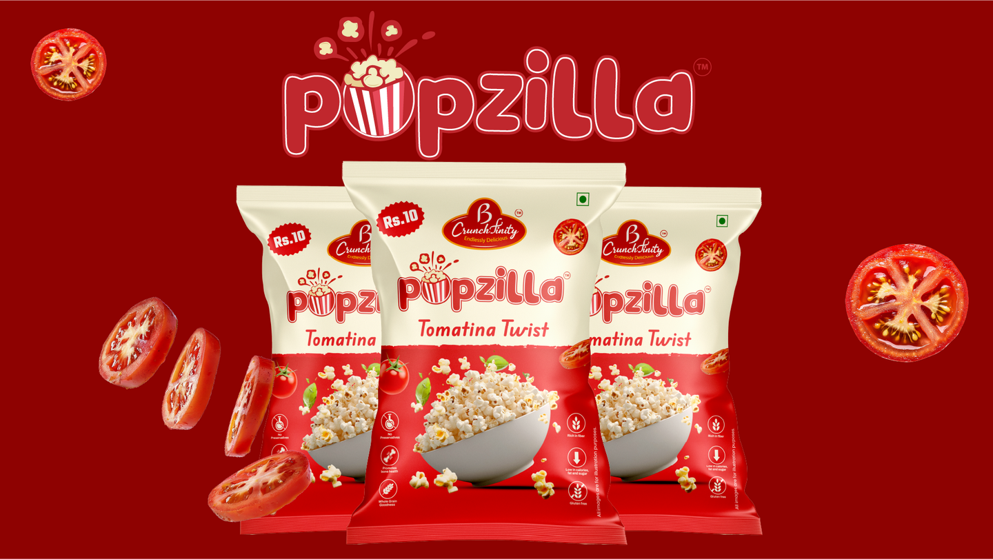
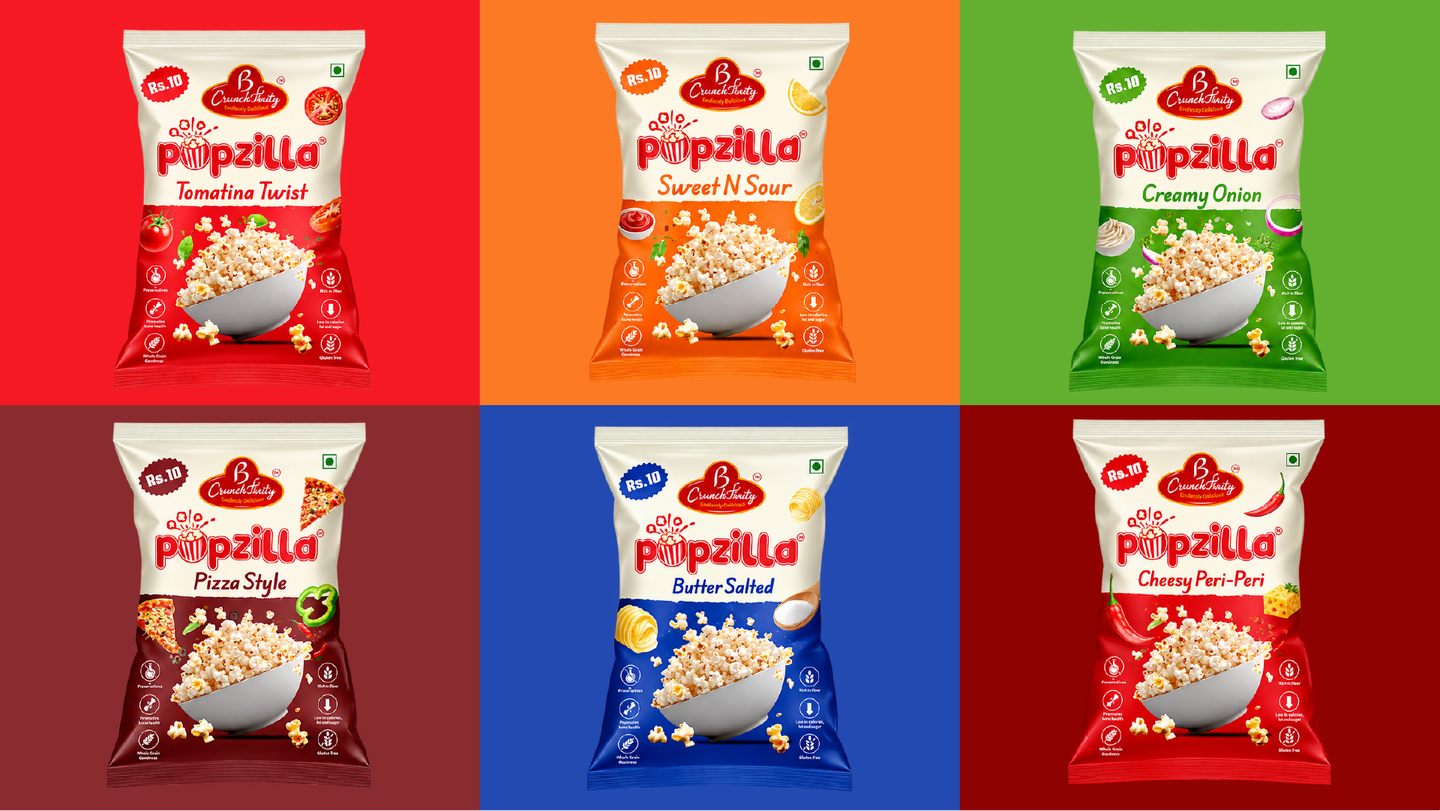
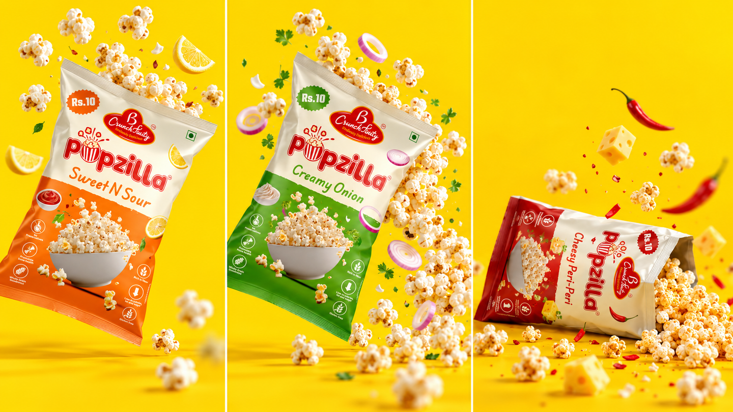
Making Every Pop Count Popzilla is a fun, flavour-packed popcorn brand built around the simple joy of snacking. For this project, we worked on the logo and popcorn packaging design, creating a visual identity that feels energetic, playful, and instantly recognisable. The idea was to give Popzilla a personality that reflects the excitement of its flavours while creating a strong presence in the competitive snack category. Our creative direction began with the logo. We wanted something bold, expressive, and easy to recognise, even on a small popcorn packet. The custom lettering, playful popcorn-inspired details, and vibrant red identity give the brand a distinctive character that feels approachable and memorable. With the logo established, we developed a packaging system for six flavours: Tomatina Twist, Sweet N Sour, Creamy Onion, Pizza Style, Butter Salted, and Cheesy Peri-Peri. Each variant needed its own personality, but the entire collection also had to look like one brand. We approached this through a consistent packaging structure supported by individual flavour colours. From bright red and orange to fresh green and bold blue, every colour was selected to help customers recognise their preferred flavour at a glance. The front of each pack features the Popzilla logo, clear flavour typography, appetising popcorn imagery, and supporting ingredient illustrations. Together, these details make the packaging visually engaging while keeping the product at the centre of attention. We also paid attention to how the designs would appear together on a retail shelf. Consistent brand placement and a recognisable layout help maintain a unified identity, while the different colours create an energetic product display. Rather than treating each flavour as a separate design, we built a flexible visual system that gives Popzilla room to introduce additional products and flavours in the future. The final result is a lively logo and packaging collection that celebrates the brand's playful spirit. From its expressive typography to its colourful flavour range, every element was designed to make Popzilla feel fun, confident, and ready to stand out.
- Hero SKU artwork
- Scallop pattern system
- Range photography
Snacks & FMCG
Hero SKU artwork Scallop pattern system Range photography
Color Palette & Architecture